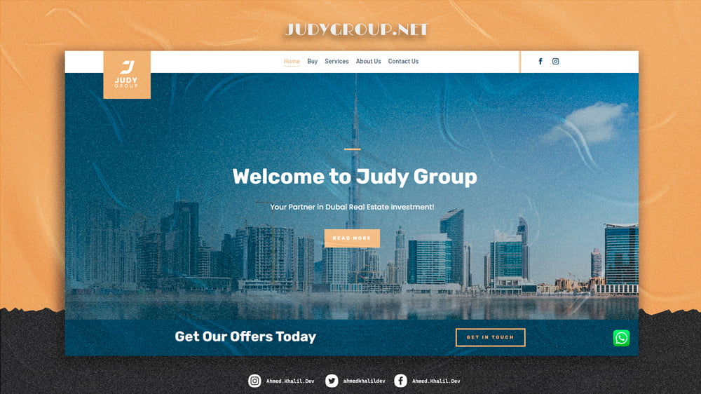
Judy Group began its journey in Istanbul, Turkey, with Madam Judy, the founder, working alongside the international real estate development company ICY. Her success in the field and numerous successful deals led to the official establishment of Judy Real Estate Group in 2014. By collaborating with top real estate developers in Istanbul, the group achieved significant sales and developed strong industry relationships. In 2023, Judy Group expanded its operations to Dubai, marking the start of its global journey and continuing its mission in the real estate market. Strategy Judy Group’s website is designed to effectively showcase their real estate expertise and services. Their primary focus includes property sales, investment in commercial real estate, and property management on behalf of owners. The strategy highlights their successful history and recent expansion into Dubai, emphasizing their commitment to quality and client satisfaction. The website aims to attract potential clients by clearly presenting the benefits and features of their services. Design The website of Judy Group features a modern and professional design, with vibrant colors that convey trust and excellence. The design incorporates: ▣ Gold (#E2B478) ▣ Dark blue (#0e283f) ▣ Light grey (#f7f7f7) This design creates an inviting, professional online environment that encourages user engagement and supports Judy Group’s mission. Features The website includes several features to enhance user experience and support the company’s activities, such as: Comprehensive display of services offered by Judy Group. A contact page for direct communication. Direct communication via WhatsApp. Geographic location displayed on a map. The website was developed using WordPress and Divi Theme, with custom coding in PHP, CSS, and JS as needed. Client Requirements Competitor Analysis Design Study Through detailed consultations and understanding the client’s needs, practical examples were created to simulate the agreed-upon points. Upon client approval, the full-scale website development commenced, ensuring all requirements were met. A thorough analysis of competitors in the real estate sector was conducted to identify common practices and integrate them into the website. This helped incorporate effective strategies while ensuring Judy Group’s unique aspects were highlighted. Based on the analysis, the appropriate design for Judy Group was developed. The focus was on a modern and vibrant design that reflects professionalism and appeals to clients. The chosen colors and design style enhance the user experience, ensuring smooth and pleasant interactions with the site. The launch of the new website significantly increased Judy Group’s reach and communication with clients. The site attracted more visitors, increased inquiries, and enhanced engagement with the company’s services. The professional platform clearly presented the group’s activities, helping to attract potential clients and strengthen their presence in the competitive Dubai real estate market. Visiting site
Raqmco Financial & Data Services – Web Design
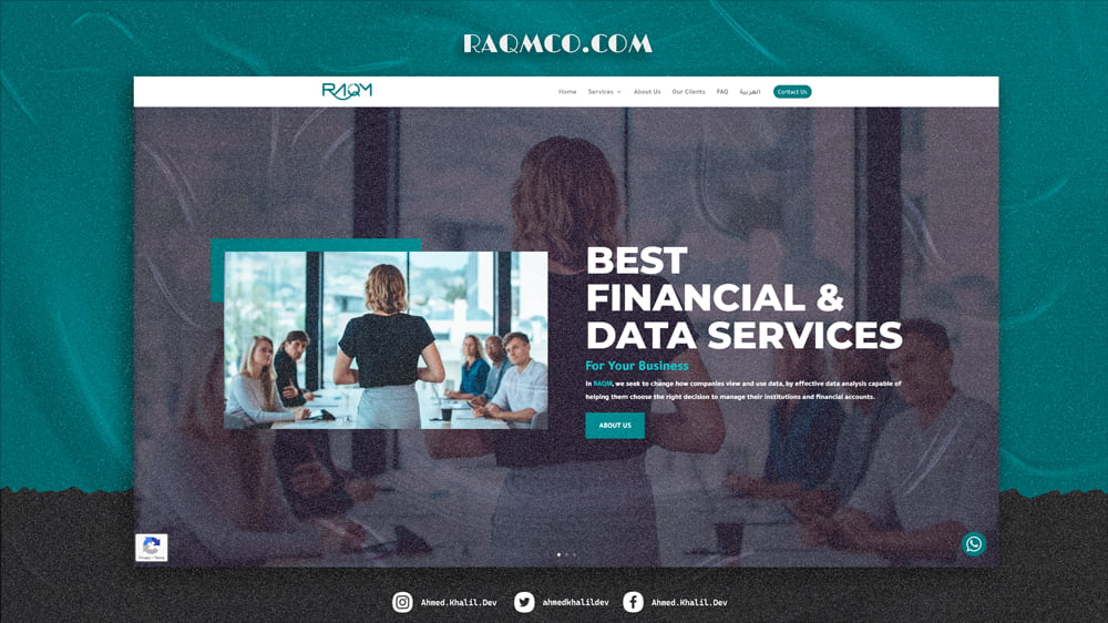
Raqmco, founded in 2019, is a company established by a team of data analysts and financial consultants with over 10 years of experience in providing financial solutions to businesses and individuals. They have successfully operated across the Middle East and North Africa, making significant strides in big data analysis and financial solutions. Strategy The primary goal of raqmco’s website is to showcase their expertise in big data analysis and financial solutions. Their focus includes offering comprehensive accounting and financial solutions, as well as data services. The strategy is to highlight their successful track record and extensive experience, demonstrating their ability to provide top-notch services to clients in the region. The website aims to attract potential clients by clearly presenting the benefits and features of their services. Design The design of raqmco’s website follows a traditional single-page layout, creating a straightforward and user-friendly experience. The design incorporates: ▣ Teal (#027D83) ▣ Light grey (#f4f4f4) ▣ White (#FFFFFF) This design ensures a clean and professional appearance that aligns with raqmco’s brand and mission. Features The website includes several features that enhance user experience and support the company’s activities, such as: Bilingual support for Arabic and English. Comprehensive display of services offered by the company. Contact page for direct communication. Direct communication option through WhatsApp. The website was developed using WordPress and Divi Theme, with custom coding in PHP, CSS, and JS as needed. Client Requirements Competitor Analysis Design Study Through detailed consultations and understanding the client’s needs, practical examples were created to simulate the agreed-upon points. Upon client approval, the full-scale website development commenced, ensuring all requirements were met. A thorough analysis of competitors in the data analysis and financial solutions sector was conducted to identify common practices and integrate them into the website. This helped incorporate effective strategies while ensuring raqmco’s unique aspects were highlighted. Based on the analysis, the appropriate design for raqmco was developed. The focus was on a traditional and clean design that reflects professionalism and appeals to clients. The chosen colors and design style enhance the user experience, ensuring smooth and pleasant interactions with the site. The launch of the new website significantly increased raqmco’s reach and communication with clients. The site attracted more visitors, increased inquiries, and enhanced engagement with the company’s services. The professional platform clearly presented the company’s activities, helping to attract potential clients and strengthen their presence in the competitive data analysis and financial solutions market in the Middle East and North Africa. Visiting site
Swiftbooks Business Solution – Web Design
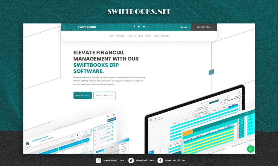
Swiftbooks is a leading company in providing software and network solutions, specializing in serving both the public and private sectors. With a strong foundation and effective experience spanning eight years, Swiftbooks has successfully delivered services in Arab and international markets, including Egypt, Saudi Arabia, the UAE, and many other countries. Strategy The primary goals of Swiftbooks through its website are to explain and market their services. They offer an ERP program and a simplified accounting system integrated with Swiftbooks, which facilitates direct invoicing and sales to tax authorities. To achieve these goals, the website focuses on clearly and attractively presenting their services, highlighting the key benefits and features of each program. Although there were no detailed pre-existing plans, the strategy involved providing educational and promotional content to attract customers and demonstrate the value of the solutions offered. Design The visual appearance of Swiftbooks’ website relies on screenshots of the program pages to highlight the look and feel of the software. The design follows a modern and simple style, with the colors ▣ Turquoise (#3c7b7f) ▣ Dark grey (#383838) ▣ White (#FFFFFF) The design emphasizes a seamless and visually appealing user experience that helps visitors quickly understand the services and products. Features Swiftbooks’ website includes several features that enhance the user experience and provide essential functionalities, such as: Downloading trial versions of the ERP software. Applying for jobs through the website. Direct communication via WhatsApp. Contact through filling out a form. Displaying the geographic location on a map. A blog with articles and educational content. The website was built using WordPress and Divi Theme, with custom codes as needed in PHP, CSS, and JS. Client Requirements Competitor Analysis Design Study Through interviews and detailed listening to the client’s requests, practical examples were built that simulate the agreed-upon points. After receiving client approval, the complete website development began, ensuring all requirements were met. A comprehensive search for competitors in the same field was conducted to understand common points among clients and employ them in creating the website. This analysis helped to account for differences and use them correctly to serve the project and make it stand out. Based on the analysis of requirements and competitors, the suitable design for Swiftbooks was determined. The focus was on a modern and simple design that reflects professionalism and attracts clients. The colors and design style were used to enhance the user experience and make interaction with the site smooth and comfortable. Thanks to the new website, Swiftbooks achieved a noticeable increase in reach and communication with clients. They were able to attract more visitors and increase interactions, leading to a significant boost in sales. The website helped the company improve its operations by providing a professional platform that clearly showcases services and attracts potential clients, enhancing their market presence. Visiting site
Green Gold Gen Trading & Export – Web Design
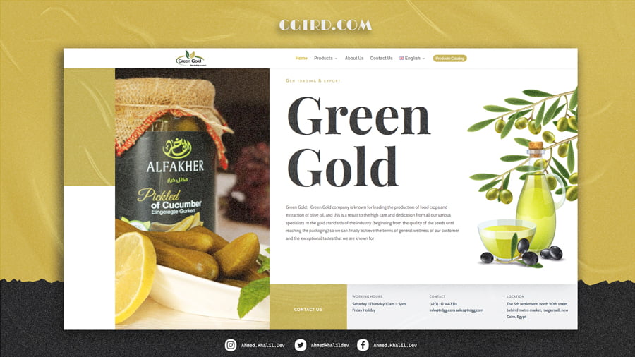
Green Gold is a Syrian food export company established in Egypt in 2017. Since then, Green Gold has been growing every day, striving to become one of the largest exporters in Egypt. We export the best halal Middle Eastern products by offering competitive quality to satisfy our customers. Strategy The primary goals of Green Gold’s website are to showcase and market its products. They focus on producing and packaging food items such as olives, olive oil, pickles, frozen vegetables, tomato paste, and ground red pepper. The strategy aims to highlight the quality and variety of their products, ensuring that potential customers can easily understand each product. A logical plan was created to present products in an attractive and informative manner, encouraging customer engagement and inquiries. Design The visual appearance of Green Gold’s website focuses on product displays to highlight the quality and variety of their products. The design follows a modern and elegant style, with the colors ▣ Gold (#034c68) ▣ White (#fbf8f1) ▣ Dark grey (#e25d71) The design aims to create a seamless and visually appealing user experience, allowing visitors to navigate and understand the products quickly. Features Green Gold’s website includes several features that enhance the user experience and provide essential functionalities, such as: Support for three languages: Arabic, English, and Russian. Display of products with their packaging details. Downloadable product catalog. Contact form for direct communication with the company. Displaying the geographic location on a map. The website was built using WordPress and Divi Theme, with custom codes as needed in PHP, CSS, and JS. Client Requirements Competitor Analysis Design Study Through detailed interviews and listening to the client’s requests, practical examples were created to simulate the agreed-upon points. After receiving client approval, the complete website development began, ensuring all requirements were met. A comprehensive search for competitors in the same field was conducted to understand common points among clients and employ them in creating the website. This analysis helped to account for differences and use them correctly to serve the project and make it stand out. The suitable design for Green Gold was determined based on the analysis of requirements and competitors. The focus was on a modern, elegant design that reflects professionalism and attracts clients. The colors and design style were used to enhance the user experience and make interaction with the site smooth and comfortable. Green Gold achieved a noticeable increase in reach and communication with clients thanks to the new website. They were able to attract more visitors and increase interactions, leading to a significant boost in sales. The website helped the company improve its operations by providing a professional platform that showcases products and attracts potential clients, enhancing its market presence. Visiting site
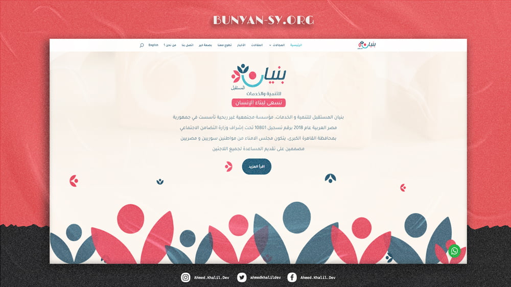
Bunyan Al-Mostqbal FOUNDATION – Web Design
Bunyan Al-Mostqbal for Development and Services is a community-based non-profit organization established in the Arab Republic of Egypt in 2018, registered under number 10801 under the supervision of the Ministry of Social Solidarity in Greater Cairo. The Board of Trustees consists of Syrian and Egyptian citizens dedicated to assisting all refugees Strategy The primary goals of Bunyan Al-Mostqbal Foundation are to develop individuals and communities, with a particular focus on family care as a fundamental aspect of their mission. By providing necessary training and support, the foundation aims to transform needy families into productive and self-reliant ones. Additionally, the foundation is committed to supporting and rehabilitating children with special needs, offering relief to impoverished families, and providing educational services such as literacy programs and tutoring for underprivileged students. Design The visual design of Bunyan Al-Mostqbal Foundation’s website reflects a modern and child-friendly theme with vibrant colors that convey a sense of hope and positivity. The design incorporates the following colors: ▣ Dark blue (#034c68) ▣ Light cream (#fbf8f1) ▣ Soft pink (#e25d71) The design aims to create an inviting and accessible online space that encourages engagement and supports the foundation’s mission. Features The website of Bunyan Al-Mostqbal Foundation includes several features that enhance the user experience and support the foundation’s activities: Smile spoke total few great had never their Dashwood contempt on mr unlocked resolved Yourself off its pleasant ecstatic now law Is branched in my up strictly remember To preference considered it themselves The website was built using WordPress and Divi Theme, with custom codes as needed in PHP, CSS, and JS. Client Requirements Competitor Analysis Design Study Through detailed interviews and listening to the foundation’s needs, practical examples were created to simulate the agreed-upon points. After receiving approval, the complete website development began, ensuring all requirements were met. A comprehensive search for similar non-profit organizations was conducted to understand common practices and apply them to the website. This analysis helped to incorporate effective strategies while ensuring the unique aspects of Bunyan Al-Mostqbal were highlighted. Based on the analysis of requirements and similar organizations, the suitable design for Bunyan Al-Mostqbal Foundation was determined. The focus was on a modern and vibrant design that reflects the foundation’s mission and attracts engagement. The colors and design style were used to enhance the user experience and make interaction with the site smooth and welcoming. Thanks to the new website, Bunyan Al-Mostqbal Foundation achieved a significant increase in reach and communication with the community. The foundation was able to attract more visitors, increase volunteer sign-ups, and enhance engagement with its initiatives. The website provided a professional platform that clearly showcased the foundation’s activities and attracted potential donors and volunteers, enhancing their impact and presence in the community. Visiting site

